Brix Coffee Beans
A comprehensive look at the design evolution of Brix Coffee's website - from initial wireframes to a modern, expressive interface that reflects the rich flavors and premium quality of specialty coffee beans. This case study showcases the iterative design process, user experience considerations, and how we leveraged AI to streamline content creation.
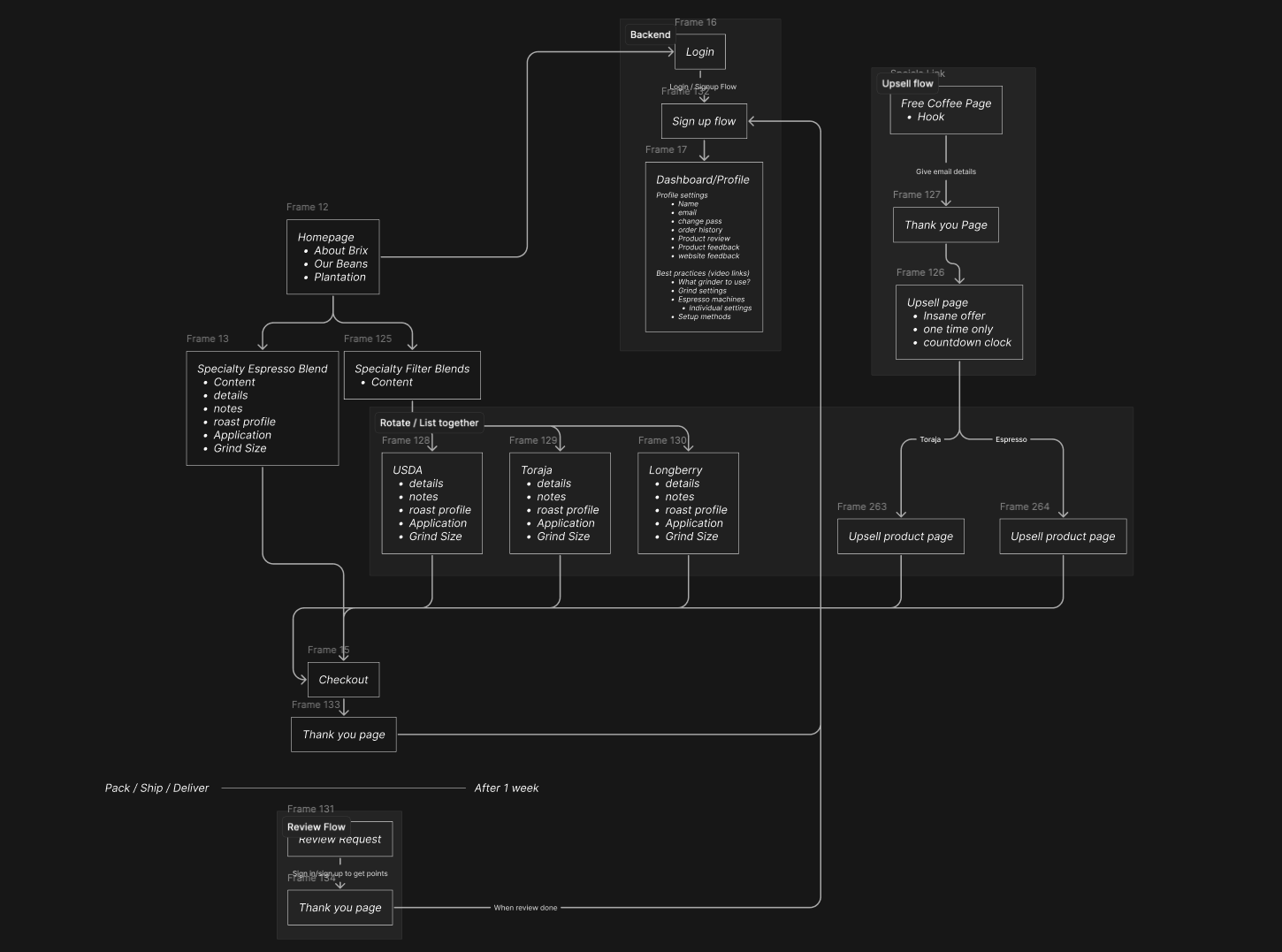
Site Flow & Information Architecture
Before diving into visual design, I mapped out the overall site structure to ensure a logical user journey from discovery to purchase. The site flow emphasizes clear navigation paths and reduced friction in the coffee buying process.
V1: Foundation & User Continuity
The first iteration focused on establishing clear user flows and demonstrating continuation throughout the site experience. My intent was to show how users would naturally progress through different sections while maintaining context and engagement.
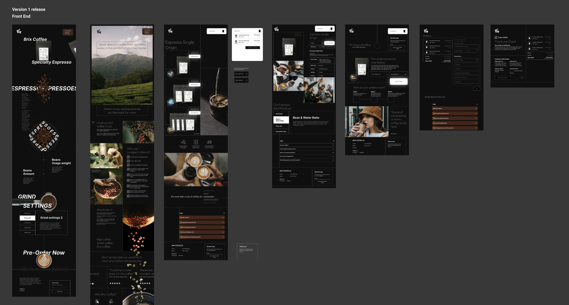
User Journey Continuation Examples
These screens demonstrate how users flow through the site, with visual cues and consistent elements that guide them from discovery to purchase.
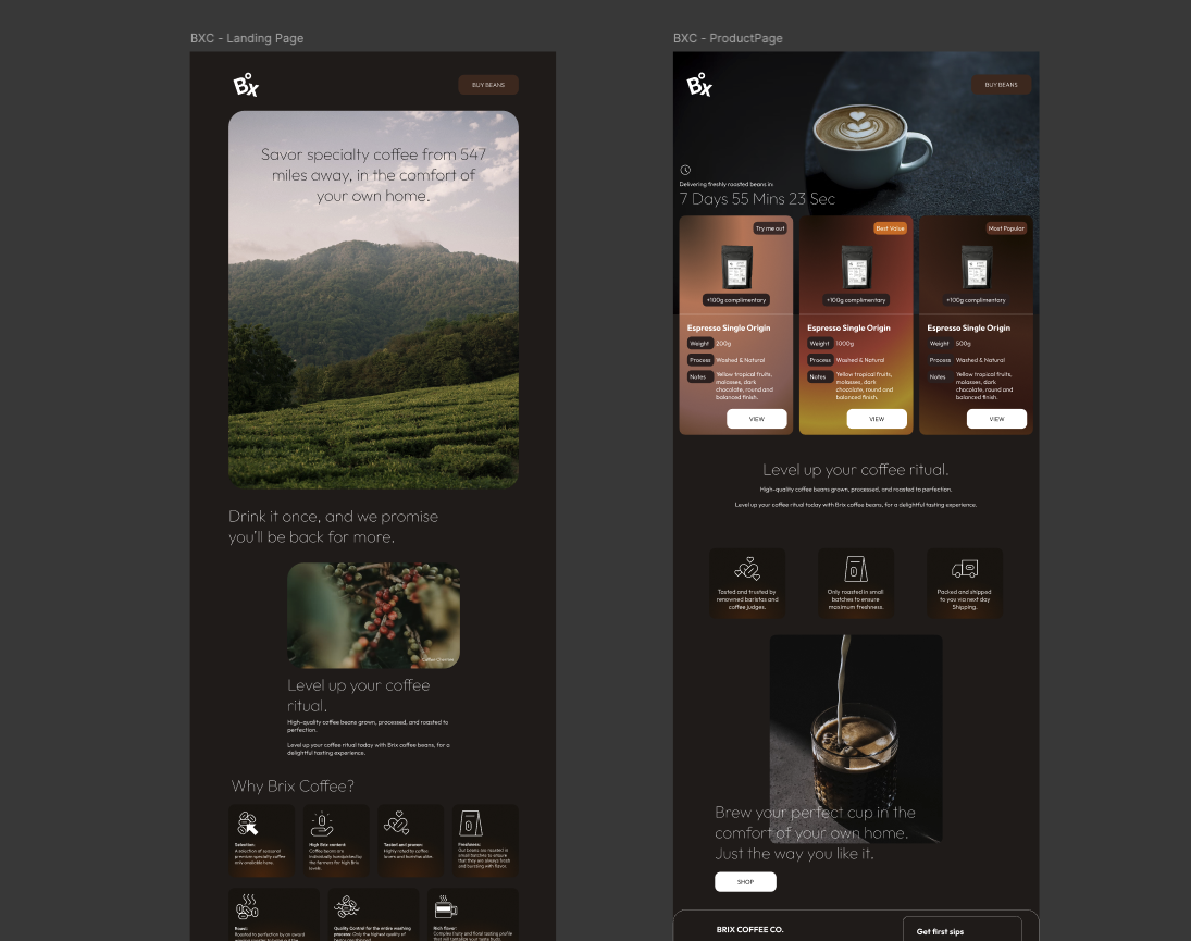
Homepage to Product Discovery
Clean entry point with immediate value proposition and clear path to browse coffee selections. The hero section establishes trust and quality perception.
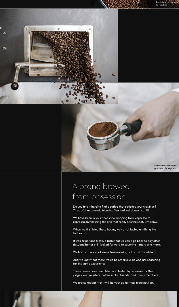
Product Selection Process
Streamlined product comparison with key information hierarchy. Users can easily understand coffee profiles and make informed decisions.
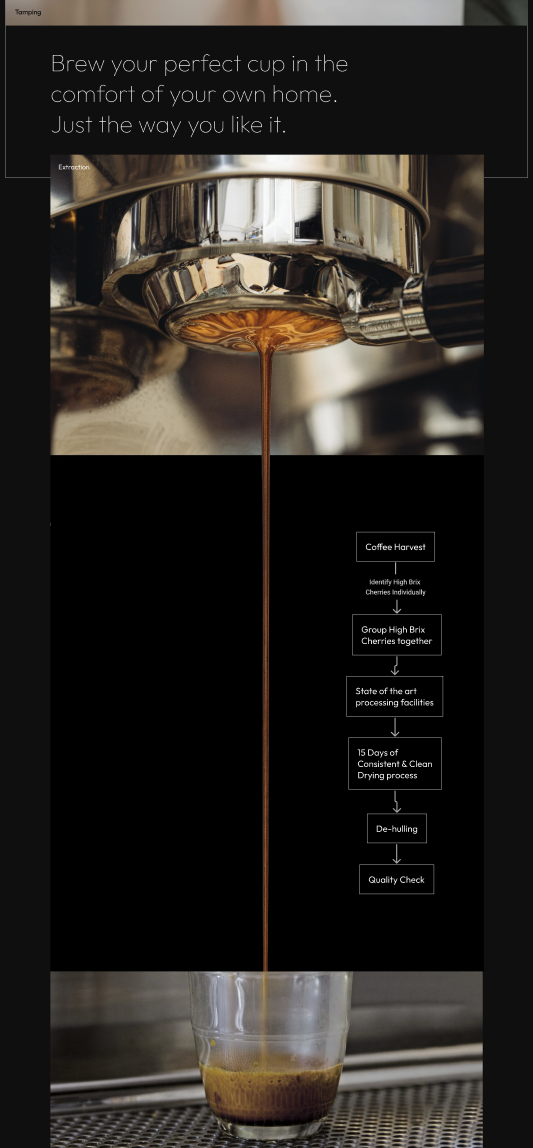
Purchase & Fulfillment
Simple checkout process with trust signals and clear next steps. Reduces abandonment with transparent shipping and delivery information.
V2: Modernization & Color Expression
The second iteration focused on modernizing the UI and introducing a more expressive color palette that reflects the rich, complex flavors of specialty coffee. I wanted the visual design to mirror the sensory experience of premium coffee tasting.
Rich Color Palette
Introduced warm browns, deep espresso tones, and vibrant accent colors that evoke the coffee experience - from bean to cup.
Modern Typography
Updated font choices and hierarchies for better readability and contemporary feel while maintaining the premium brand positioning.
Enhanced Visual Hierarchy
Stronger contrast and spacing to guide attention to key elements like product quality indicators and purchasing actions.
Flavor-Driven Design
Color choices specifically reflect coffee tasting notes - fruity highlights, chocolate undertones, and smooth cream accents.
V3: Component System & Design Intent
The final iteration involved breaking down the design into a systematic component library. Each component was designed with specific intent to enhance user experience and reinforce the brand's premium coffee positioning.
Navigation System
Clean, intuitive navigation that prioritizes product discovery and educational content about coffee quality. Sticky elements ensure easy access to key actions.
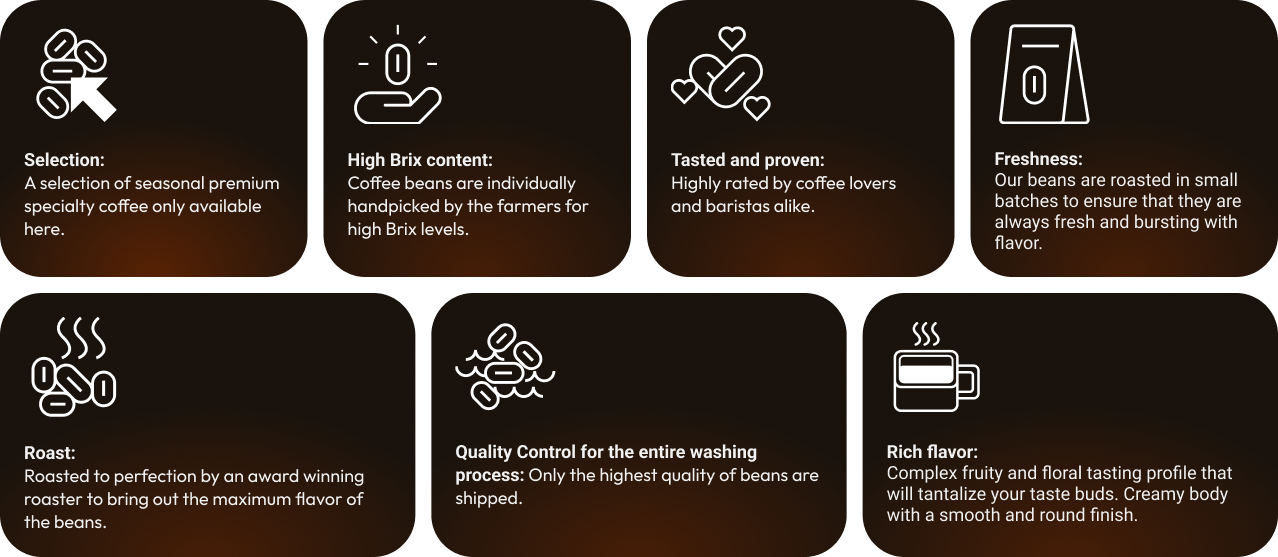
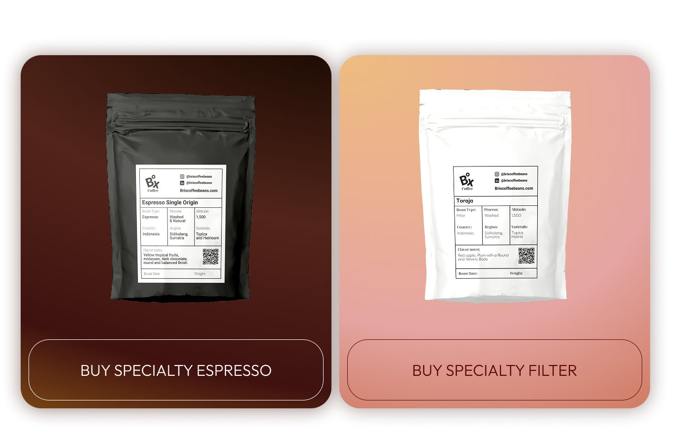
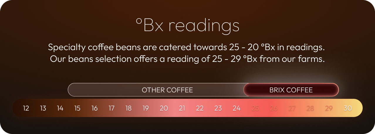
Product Cards
Designed to highlight key quality indicators like Brix ratings, processing methods, and flavor profiles. Visual hierarchy guides users to most important information first.
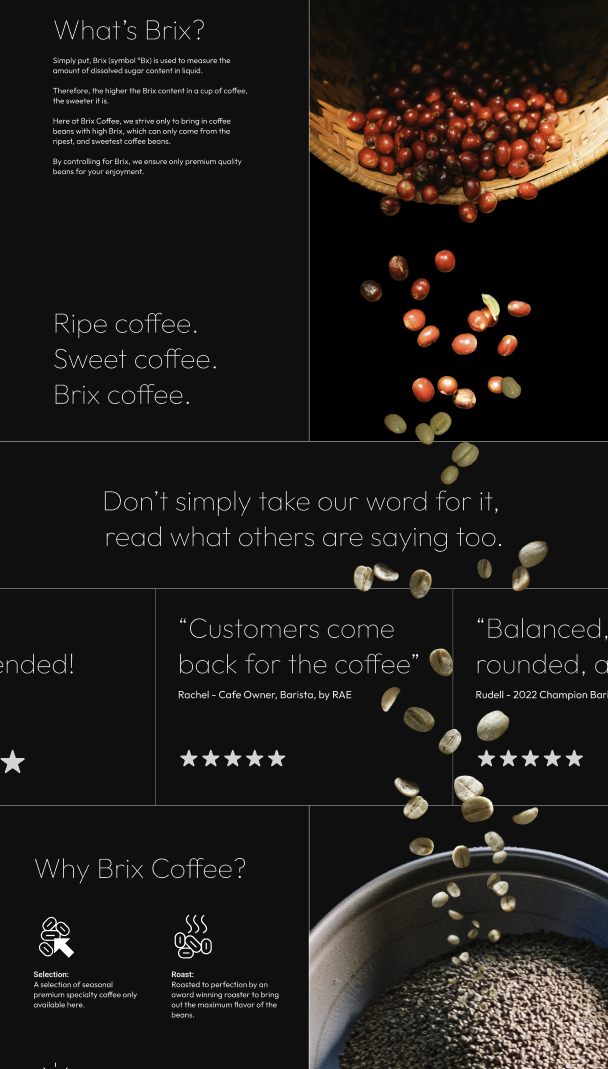
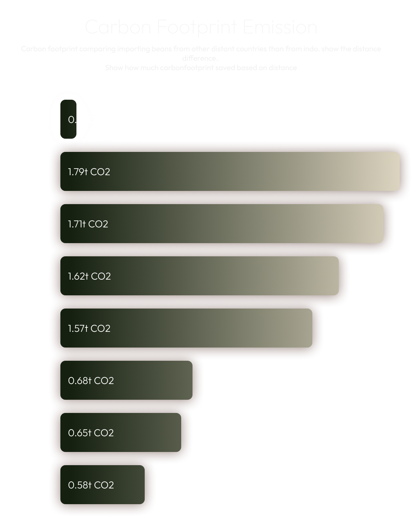
Educational Content
Components designed to build trust through education about coffee quality, processing methods, and sustainability practices. Balances information density with readability.
Interactive Elements
Buttons, forms, and micro-interactions designed to feel premium and responsive. Consistent with the overall brand aesthetic while prioritizing usability.
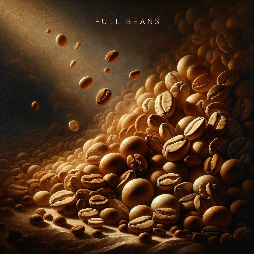
AI-Generated Content Gallery
To streamline our content creation process, we leveraged AI-generated imagery for coffee brewing method illustrations and lifestyle photography. This approach allowed us to maintain visual consistency while reducing production costs and timelines.
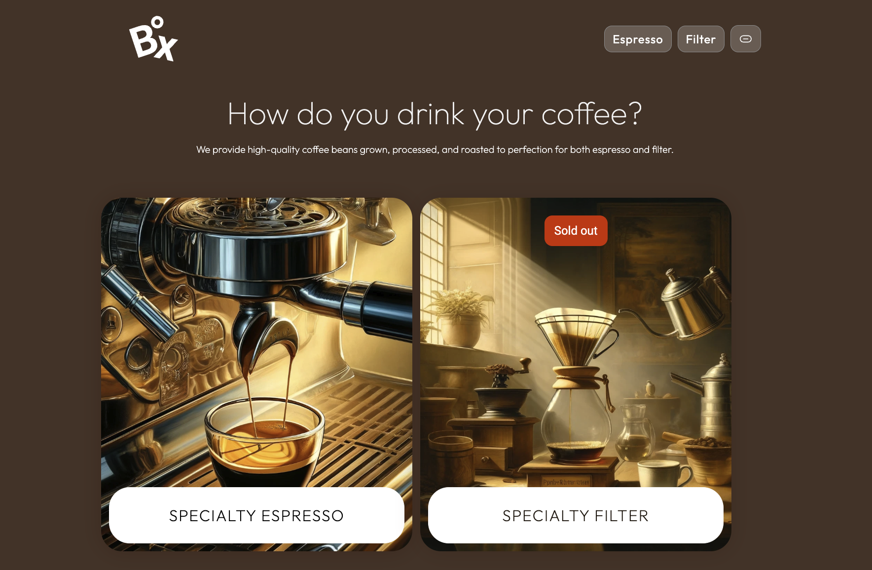
Espresso
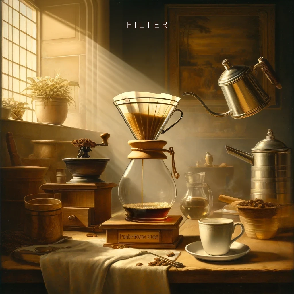
Filter Coffee
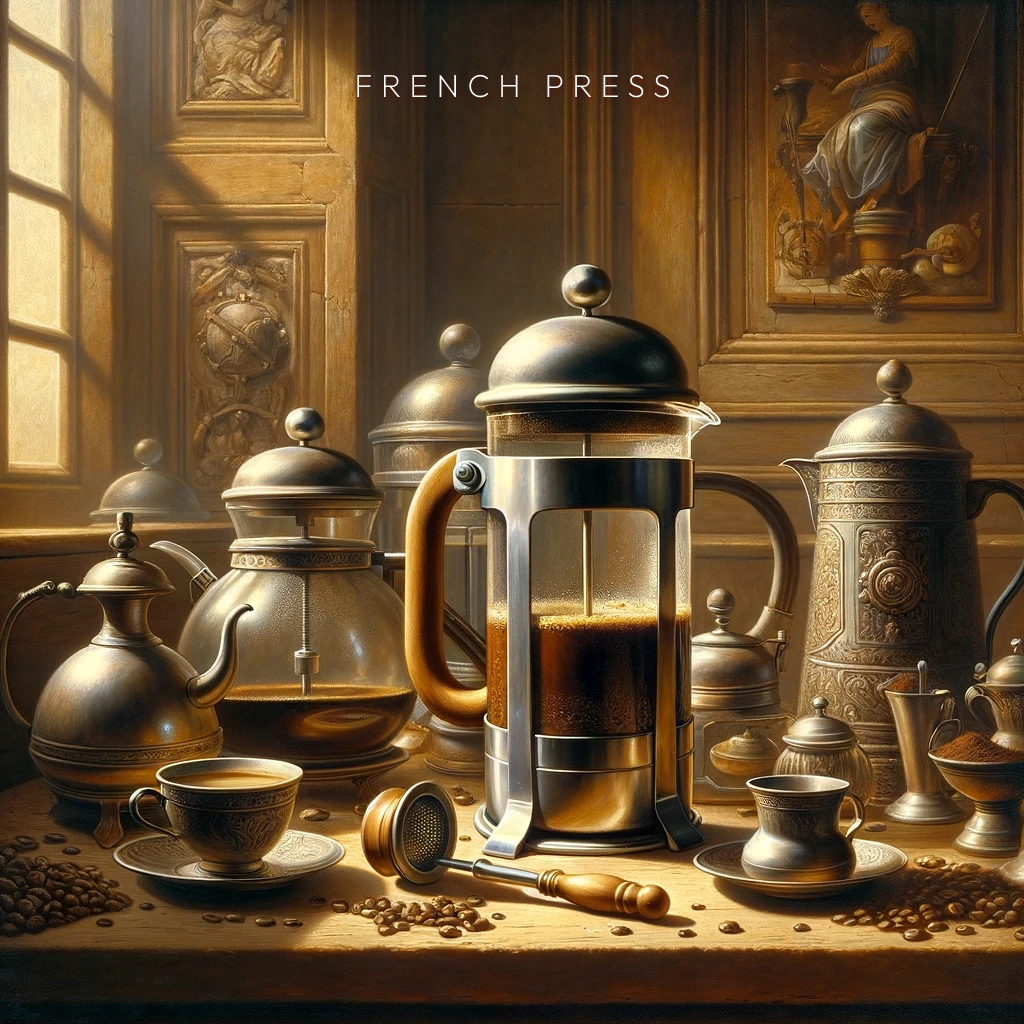
French Press
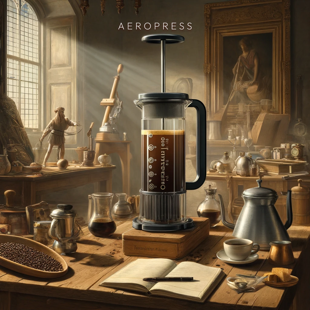
Aeropress
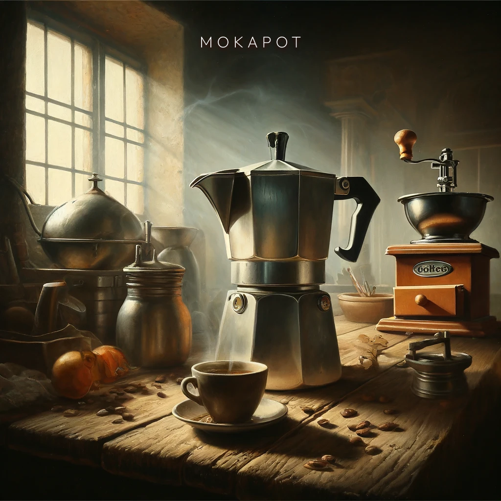
Moka Pot
Going Live
The design process culminated in a fully functional e-commerce website that brings together premium specialty coffee with an equally premium digital experience. Visit the live site to see how these design decisions translate into real user interactions.